
Why you need to know Roy G. Biv when choosing a color scheme for your home…
Color is a great place to start in exploring your personal design tastes, because our reactions to it tend to be instinctual and very personal. Start by letting go of any preconceived ideas about color. Forget what you may have read about what’s trendy in fashion or interiors and really pay attention to what you’re naturally drawn to. Does that red wall make you feel energized or claustrophobic? When browsing in a clothing boutique, do you gravitate towards saturated, vivid colors or more subtle tones mixed with gray or black? How about nature: is it a periwinkle blue sky that makes you feel at ease, the deep tones of greenery, or sunny yellow blossoms on a tree near your home?
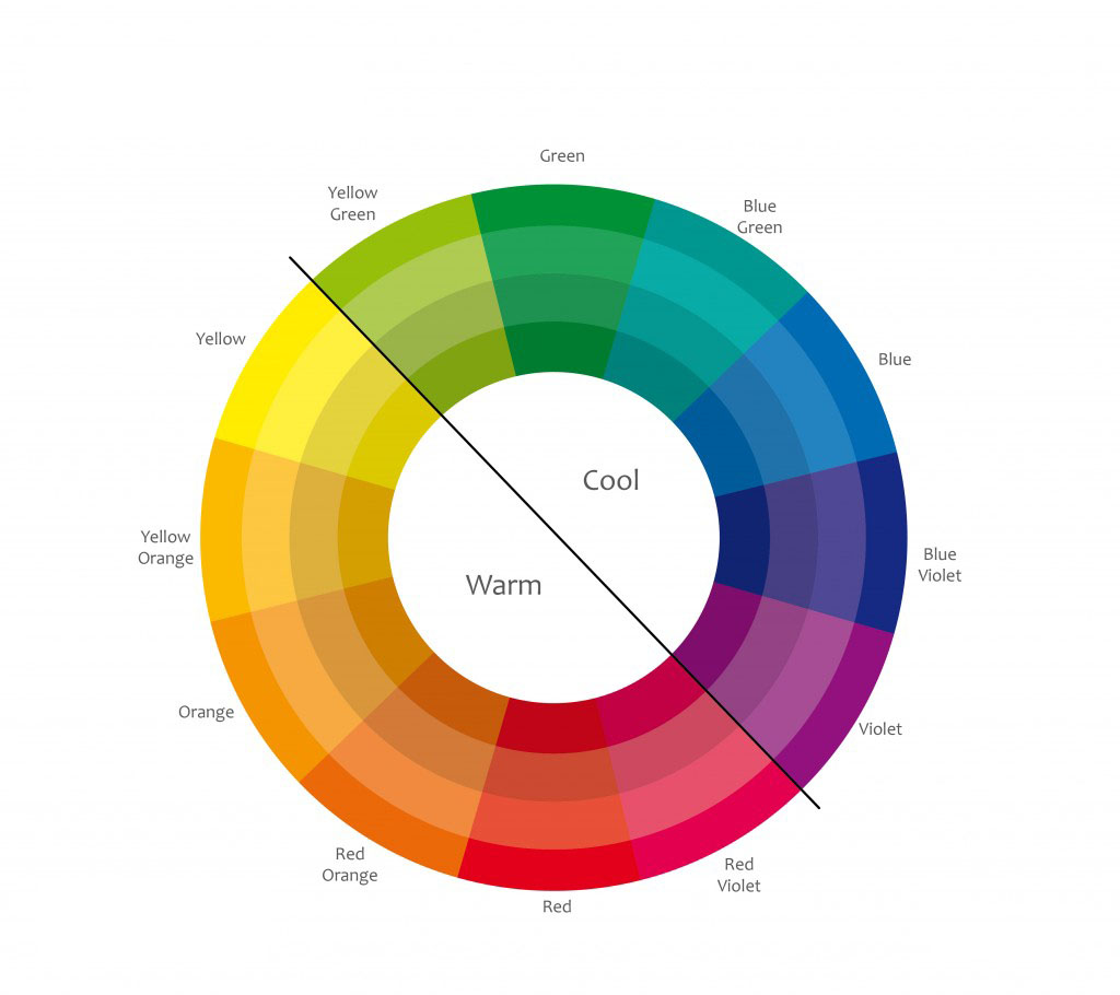
Let’s say that green evokes a response that you’d like to bring into your home. Now, how to use it? Here’s where you need to have some idea of the kind of energy and atmosphere you want to create in your space. Marc Chagall tells us that “all colors are the friends of their neighbors and the lovers of their opposites.” Each has their benefit, of course - passion at its best is exciting and energizing, but messy when it goes wrong. Friendship should be uplifting, comfortable and relaxed.

If it’s drama you’re after, you’ll want to focus on colors that are opposite to one another on the wheel, known as complementary. For green, that’s red. Are you thinking Christmas yet? Pure red and green would easily head in that direction, but when we select variations on the hue, the result is more nuanced and sophisticated. In living room #1 (pictured), the color scheme follows from the large abstract hung above the sofa. A vibrant red was an easy choice with the painting, but can you imagine the room with something else in place of the green? There are warm yellows, bold blues and deep reddish-browns. The light, fresh, spring green chosen by the designer relates to subtle yellow-green tones in the painting, but gives the room a completely different feel. Less obvious usually equates to more interesting.
Toning It Up & Down
Using tones adjacent to one another on the color wheel creates an analogous color palette. It’s calming for your eyes, and tends to be easier to get right. Friendship doesn’t have to mean boredom, however. The bedroom (pictured) is a great example of this. Warm yellow and beige tones mix with icy greens and touches of turquoise. The color is most vibrant on the drapery, skirted table and trim on pillows, but your eyes don’t have to work hard to connect it all. Another part of what works in this example is the way the color varies. For a more interesting palette, you’ll need to think beyond the pure colors (called hues) that we learn as children. A hue mixed with white creates a tint, gray for a tone and black for a shade. Imagine a room done completely in pastels. You may love the colors individually, but together they’ll look young and overly saccharine. Using all shades can result in a dull space. Together, however, the contrast between them will make both more compelling - lights look lighter and darks look darker. The most interesting and layered spaces will use a mix of hues, tints, tones and shades.

You might think that the easiest color palette to develop in your space would be monochromatic, but that isn’t necessarily true. Your color variations need to be chosen carefully in order to get the look you want. Too similar but not identical, and they may clash; too dissimilar, and they won’t connect. The phrase “same same, but different” comes to mind here. Monochromatic doesn’t have to mean safe or simple either. In living room #2 (pictured), do you notice the way the use of color draws your eyes upwards? Beginning with the black and white floor, you naturally work up from the emerald sofa to the medium-toned screen, the lighter yellow-green on the walls, and finally the white chandelier. There’s a lot more happening in this space to make it work, but you can see that color plays a large part. A monochromatic palette actually allowed the designer to be bolder and more playful in other elements of the space, such as pattern and texture.

With endless variations on Roy G. Biv (red, orange, yellow, green, blue, indigo and violet), this can only be a starting point. But let’s review. First, know your own personal and emotional response to color, and find a match for that in the feeling you want to create in your space. Second, generate calm with analogous color, or drama with complementary. Finally, build a more sophisticated palette by layering variations on your initial choices. And with that, you’re ready to begin.
As an interior and furniture designer for Austin Home Interiors, McNeill Shiner is always looking for new ways to mix styles and influences to create spaces that are uplifting, comfortable and very personal.