While George Constanza may think it a good idea to drape himself in velvet, the same is not true for your home.
Gone are the days where a matching set of wood furniture, polished to the point of reflection, was the height of class. The most welcoming and dynamic spaces are characterized by a mix of materials and textures that imply the interesting and well-rounded nature of their owner. A tall order for an interior? Perhaps, but not as hard as it sounds.
Texture refers to the tactile nature of a material’s surface — the way it feels, or the way it looks like it feels. If you’ve read the previous two columns on color and line, you’re probably getting the hang of how this works. Different textures will impact the way that we perceive a space: soft and cushy surfaces seem warm and inviting, glossy and sleek can denote modernity and efficiency and rough or natural might invoke a casual tone. Texture includes fabric, but also materials and finishes — wood, metal, paint, glass, lacquer, leather, and the like. Think about the endless variations on wood alone: polished, unfinished, salvaged, exotic, antiqued or distressed. As with anything else, it’s always possible to have too much of a good thing. Relying too heavily on lush textures such as velvets and chenille can wind up looking a bit… well, heavy. An abundance of glossy, man-made surfaces feels sterile without a touch of the rough or natural. Using contrasting textures in a space will accentuate the differences between them, and also give the eye a place to rest.
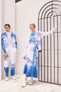
Pattern mixing has had a major moment in fashion recently and the principles are more or less the same in interiors. The simplest rule to remember is to maintain contrast between two patterns so they can each stand alone. Easy combinations include a floral with a stripe, geometric with a figural, or ethnic with an animal print. Scale matters, too. In fashion, a smaller scale print is generally more flattering on a petite frame. In your space, a small chair probably won’t do justice to a pattern with a large repeat, and a large piece can be overwhelming in a small pattern.
Just one note for the pattern-fearless fashionistas among us: no matter how bold or funky your style and how high-quality your materials, using all printed cotton or linen fabrics will lack sophistication and depth. Add a cut velvet, jacquard or embroidery to take it up a notch. The sitting area by Christina Murphy has a lot going on patternwise, but it manages to be bold without overwhelming. The limited color palette is part of this. Notice how the floor visually melts into the walls and ceiling? The mirrored chest in the corner is a clever choice; reflecting the wallpaper adjacent to it, the piece virtually disappears. Scalewise, the two largest expanses (walls and floor) are in complete contrast to one another, allowing the wallpaper to take the lead. A small-scaledticking stripe on the chair, small tile pattern on the daybed pillow, and medium ikat on the chair, the source of the room’s color palette, round out the pattern play. If you’re sticking to a neutral color palette, pattern and especially texture are your friends. Even calm, soothing spaces need visual interest!
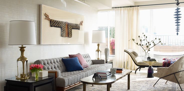
Although the Wesley Moon living room gives the impression of effortlessness, the designer thought carefully about how to balance and layer textures. Wood, metal (both polished and rough), glass, linen, and velvet are all present. Even the most pattern-phobic will acknowledge that use of the element here is subtle and balanced. Ready to explore pattern and texture in your own home? If you’re nervous, start with something small and lowcommitment. Experimenting with pillows on your sofa is a great option for this: it’s fairly inexpensive, easy to change with your mood and can showcase how different elements work together. You’ll be moving on to bigger things in no time!
As an interior and furniture designer for Austin Home Interiors, McNeill Shiner is always looking for new ways to mix styles and influences to create spaces that are uplifting, comfortable and very personal.