In this month’s design column we look at how to mix and match interior design styles and make it all work.
The principle of contrast probably makes you think of color, and that’s a natural place to start - black and white or complementary color palettes are classic sources of contrast. However, you can also use contrast in pairing architecture, furniture or art styles together (modern with vintage or antique), textures (smooth and shiny with rough or soft) and form (straight shapes with curvy ones). In terms of effect, contrast draws your attention, whereas grouping items with similar features allows your eyes to pass over them. Contrast is exciting, similarity is calming; every space needs some of both.
The iconic Louis Ghost Chair by Phillippe Starck is a study in contrasts in itself - it marries the neoclassical style of Louis XVI with sleek, glossy Lucite, to stunning effect. But we can even go a step further and see how interior designers have mixed this piece with other elements for both similarity and contrast.
The Swedish kitchen photographed by Rebecca Martyn plays with contrast in the largely black and white color palette, and certainly with the single copper pendant, but the chairs’ Lucite material fits right in. In fact, there isn’t much variation in texture here at all, as it ranges from smooth and matte to downright shiny. How would the space feel different if the designer hadn’t chosen to whitewash the wood floors? How might that affect where your eye is drawn?
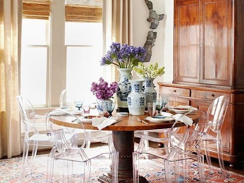
The Better Homes & Gardens dining room takes a different approach. Style-wise, it’s quite a cohesive space, and the original wood-framed Louis XVI chair would be perfectly at home. Instead, the Louis Ghost’s sleek modern material pops and makes a serious statement among the many classic elements. Whether you love or hate this choice, you certainly can’t help but notice it. On a side note, the translucent chairs are a smart choice for what looks to be a small space.
When you do opt for contrast, be sure there’s enough of a difference between the two elements so it appears purposeful. You may recall from an earlier column that a major key to mixing patterns successfully is considering scale and size. Two geometrics side by side might look like an accident rather than a choice, but one large and one small will highlight the individual qualities of each. A geometric plus something completely different, like a floral or a tonal texture? Even more so. The principle applies elsewhere as well, so always make those choices intentionally.
Dining rooms are a good place to analyze similarity and contrast, because the components involved tend to be limited - table, chairs, chandelier, art, and possibly a rug, sideboard and window treatments. There isn’t a whole lot of innovation in layout either, so all of this makes it easier for you to hone in on sources of contrast. Are you seeing variation in color, style or material? Which do you find most appealing? Pinterest.com is always my favorite place to browse interior images, but you can also use Houzz or even Google Images for ideas.
*As an interior and furniture designer for Austin Home Interiors, McNeill Shiner is always looking for new ways to mix styles and influences to create spaces that are uplifting, comfortable and very personal.